
Introduction: The Cost of Poor UX
Your platform is losing money every day. You just don’t know where.
The problem isn't always obvious. Traffic looks stable. Your team is busy. But somewhere in your user journey, potential customers are slipping away. They want what you offer - but your interface makes it too hard to get it.
Poor UX (user experience) is a revenue leak that compounds over time. Most business owners wait too long to fix their UX. They treat redesigns as "nice to have" projects. But every month you delay, you lose leads you could have converted and customers who never return.
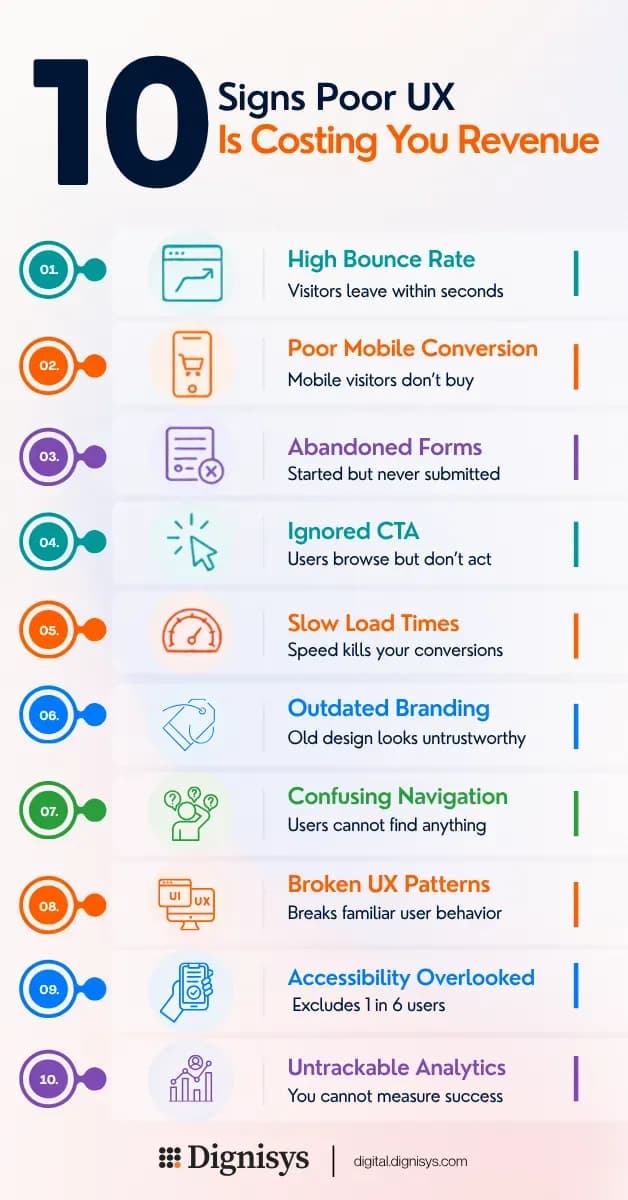
This post walks through ten clear signs your website or app needs a UX redesign. If you recognize even three of these, you are missing out on potential business.
1. Your Bounce Rate Is Climbing
Your platform bounce rate is rising. This means visitors arrive and leave within seconds. They do not scroll. They do not click. They just go.
Why this Happens
Your homepage does not answer the question people came to ask. The visual hierarchy is wrong. Users cannot find the value in the first 3 seconds.
Why it Matters
Every bounce represents a potential lead you paid to attract. You are spending budget to send people to a page that fails to engage them.
How we Fix it
We study heatmaps and session recordings to see exactly where users look and where they stop. We then restructure your layout to place your core value proposition front and center.
2. Mobile Visitors Are Not Converting
Your analytics show mobile traffic is growing. But mobile conversion rates lag far behind desktop.
Why this Happens
Buttons are too small to tap. Forms are impossible to fill on a phone. Text requires pinching and zooming.
Why it Matters
60% of online users browse on mobile - and they're leaving your website without buying. Further, Google prioritizes mobile-first indexing. If your mobile experience is poor, your search rankings suffer.
How we Fix it
We design mobile-first, not as an afterthought. We build touch-friendly interfaces with thumb-zone navigation and readable typefaces that work on any screen size.
3. Visitors Start Forms but Never Submit
You see form starts in your analytics. But completion rates are low.
Why this Happens
You are asking too many questions. Field labels are confusing. The design does not inspire trust.
Why it Matters
Each abandoned form is a lead you almost had. Multiply that by your average customer value, and you see the real cost of a broken interface.
How we Fix it
We audit every form field and remove unnecessary friction. We add progress indicators and position trust signals near submit buttons to ease anxiety.
4. Users Ignore your Call-to-Action
Users ignore your call to action. They click around. They seem interested. But they do not complete the key action you want (signing up, purchasing, or booking).
Why this Happens
The user journey has friction points. Maybe the checkout flow is confusing. Maybe the "next step" or Call-to-Action (CTA) button is hidden.
Why it Matters
Users leave without completing actions because they did not get enough value to commit. You are losing potential revenue from people who were already interested.
How we Fix it
We map your user journey step by step. We identify friction points and redesign flows to reduce drop-offs. We use A/B testing to validate improvements before full rollout.
5. Your Platform Feels Slow
Page load times are creeping up. Users complain. Your team accepts it as "normal."
Why this Happens
Bloated design assets. Unoptimized images. Too many heavy animations.
Why it Matters
Every one-second delay reduces conversions by 7%. If your site loads in three seconds instead of two, you lose 7% of potential revenue.
How we Fix it
We compress image assets without sacrificing quality. We streamline animations and remove visual bloat that slows rendering.
6. Your Brand Looks Outdated
Visitors land on your site and feel they've been transported back in time. You are using dated fonts. Colours feel off. Visual hierarchy is flat.
Why it Happens
Your brand has evolved, but your digital presence has not kept up. Competitors with modern designs are outperforming you.
Why it Matters
75% of users admit to judging credibility based on website design. If your design feels old, visitors assume your business is old.
How we Fix it
We build a modern visual identity system that works across your website and app. Consistent, clean design builds trust instantly.
7. Navigation Is Confusing
Users cannot find basic information. Your support team gets constant "where is X?" questions.
Why this Happens
Your navigation labels are vague. Your information architecture does not match how users think.
Why it Matters
Every minute a user spends hunting for information is a minute they are not converting. Confused users leave.
How we Fix it
We restructure your navigation based on user mental models. We simplify menu labels and create clear pathways to key actions.
8. Your Interface Does Not Match User Expectations
Users try to click things that are not clickable. They scroll where they should not. They get lost.
Why this Happens
You violated standard UX patterns. Users have learned behaviors from other platforms. When you break those patterns, you break their flow.
Why it Matters
Unintuitive design forces users to relearn how to use your platform. Most will not bother. They will find a competitor that feels familiar.
How we Fix it
We use standard, proven UX patterns while adding your unique brand flare. We never sacrifice usability for novelty.
9. Accessibility Is an Afterthought
Your platform lacks digital accessibility. This means users with disabilities cannot navigate your site. Screen readers struggle. Colour contrast fails standards.
Why this Happens
You designed for the "average" user and ignored the rest.
Why it Matters
One in six people has a disability. That is 16% of potential customers who cannot use your platform. You are leaving that revenue on the table.
How we Fix it
We design for accessibility and WCAG standards from the start. We test with real users. Inclusive design is good business.
10. You Cannot Track What Matters
Your analytics are a mess. You cannot tell which pages convert. You guess instead of measuring.
Why this Happens
Your design does not guide users toward measurable actions. Events are not configured. Clicks are not tracked.
Why it Matters
Without accurate data, you cannot improve. You waste budget on guesswork. You miss opportunities to optimize.
How we Fix it
We design with analytics in mind. We set up proper event tracking and clear conversion funnels so you can see exactly what is working.
What Happens After a UX Redesign
A proper UX redesign is not about looking pretty. It is about removing friction so users can get value immediately. Measurable improvements include:
- •Increase in conversion rate
- •Drop in support tickets
- •Users spend more time engaging with content
- •Improvement in marketing ROI
However, this requires a UI UX design agency that understands your users, your business goals, and your specific context.
The Dignisys UX Redesign Process
Our creativity is guided by data. We follow a structured design process:
- 1.Discovery: We interview your stakeholders and analyze your data. We understand your users and their needs.
- 2.Research: We conduct user testing on your current platform. We identify friction points and pain points.
- 3.Strategy: We create a design roadmap aligned with your business goals. We prioritize high-impact improvements.
- 4.Prototyping: We build clickable prototypes and test them with real users. We iterate based on feedback.
- 5.Visual Design: We apply modern UI principles to create a clean, trustworthy interface.
- 6.Usability Testing: We test the final design with users to ensure it works.
- 7.Handoff: We deliver developer-ready design: clean files, style guides and specifications.
Common Concerns about UX Redesign
"We just redesigned three years ago."
Technology and user expectations evolve fast. Three years is a lifetime in UX. What worked then frustrates users today.
"We do not have budget for a full redesign."
Start with a UX audit. Identify the highest-impact fixes first. You do not need to redesign everything at once.
"Our developer says the platform is fine."
Your developer focuses on technical function. Conversion also depends on user experience - both matter.
Next Steps
You recognize at least three of these signs. That means you're experiencing the cost of poor UX - in leads and revenue. The question is not whether you should act. The question is how quickly.
We offer a comprehensive UX Review that identifies key data points for you: where exactly your users are dropping off; and what design changes will have the biggest impact on your bottom line. This review gives you a clear roadmap for improvement.
Request a UX review today. We will analyze your platform, identify revenue leaks, and show you exactly how to fix them.